Acquisition Pop-Up
NoteConfiguring this widget will be done with the help of your Technical Account Manager. This documentation is meant to outline the basic parameters and configurable elements but is not comprehensive of the widget’s capabilities. Please reach out to your Customer Success team to learn more.
The acquisition widget is a pop-up, full-screen takeover, banner, or button that appears on your website and prompts customers to sign up for your mobile marketing program. The flow allows you to capture mobile phone numbers, email addresses, and custom fields, if desired.
To use the widget, you will need to install a configurable JavaScript to your ecommerce website. In this article, we’ll talk about the various configurable elements of the file, which you will need to discuss with your Technical Account Manager.
Flow Options
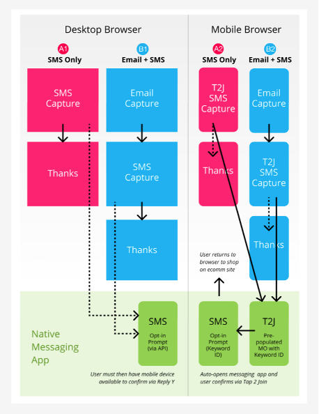
The first step in configuring your widget is to decide which information you’d like to collect. Currently, we offer two options:
- Option A: Collect SMS only
- Option B: Collect SMS and email
See the below flowchart to see an outline of each flow:
Display Options
The next thing you’ll need to decide is how you want your acquisition widget to display. Currently, we have three options:
- Traditional pop-up
- Banner
- Button
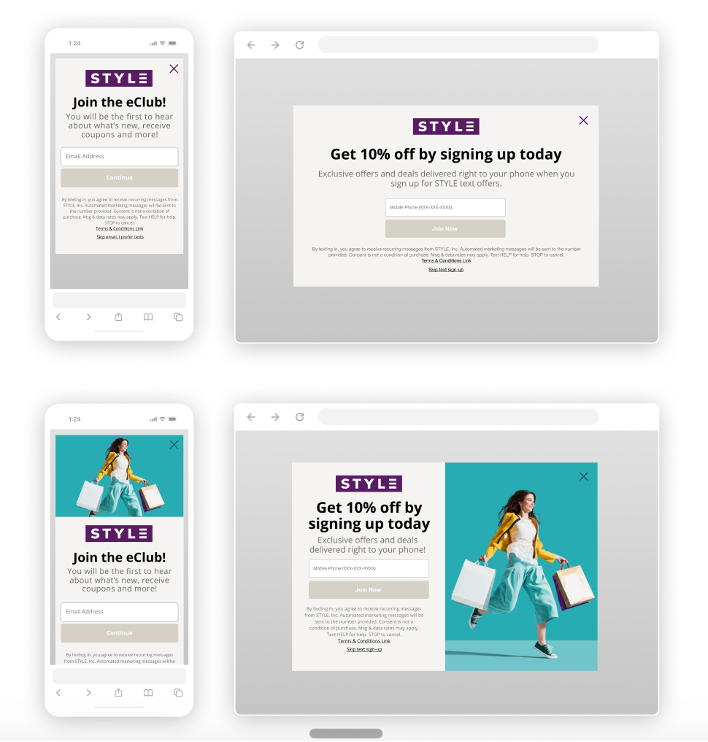
Traditional pop-up
A pop-up appears over your website content. You can configure this pop-up to display after a set amount of time or set it to display immediately when the page loads.
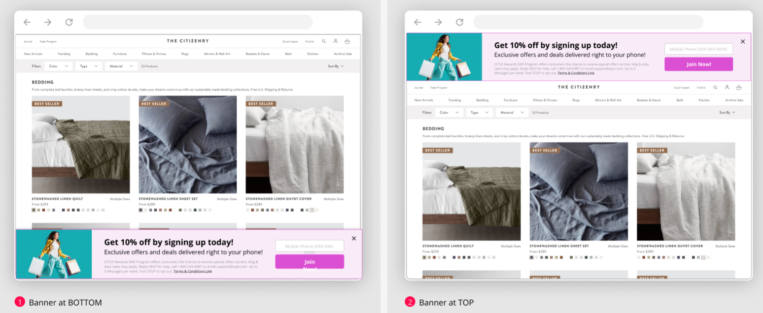
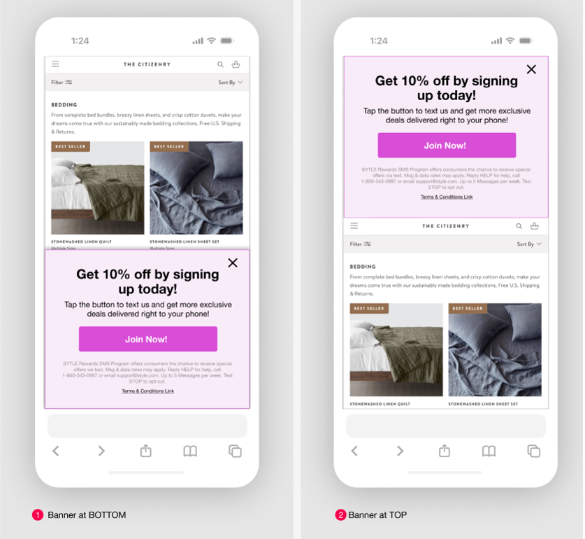
Banner
A partial banner displayed at the top or bottom of your webpage. If top is selected, your page content will be pushed down underneath the banner.
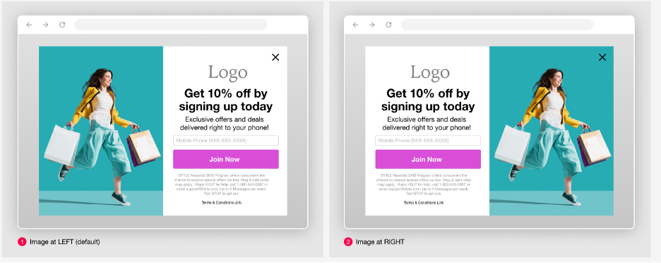
For desktop, you may include an image to display on the left or right of your banner. For mobile, the image will not display.
Desktop
Mobile
Bubble
A small floating banner with a single line of copy. Visitors of your website can click on the button to expand to a banner or open the pop-up experience. They can also click the X icon to hide the bubble, which will hide the experience until the cookie settings expire.
You can choose the bubble to display at any corner.
Desktop
Mobile
Configurable Options
Global parameters
The following table contains global parameters you will use to customize your widget.
| Parameter | Type | Description |
|---|---|---|
widgetId | string | Unique alphanumeric ID for your widget |
isEmailCaptureEnabled | Boolean | Configures whether your pop-up captures the user’s email along with mobile phone |
isNumberStepSkipable | Boolean | Enable or disable the skip button for mobile phone number input. It is not recommended to disable skip. |
isEmailStepSkipable | Boolean | Enable or disable the skip button for email input. It is not recommended to disable skip. |
zIndex | number | Controls the stacking order of the pop-up on your page. Elements will higher z-indexes will appear in front of elements with lower z-index values. |
logoUrl | string | Externally hosted URL for your brand logo |
font | string | Include either a URL to load your font, or if using a font family already on your website, use the familyName element |
isDarkMode | Boolean | enable/disable dark mode |
theme | object | An object that allows you to set colors for the light/dark mode. Accepts both RGBx and HEX values. Within this object, you can set:
|
appearDelay | number (seconds) | Time delay before pop-up appears, measured in seconds |
dismissDelay | number (seconds) | How long after a user dismisses the pop-up that it will appear again, measured in seconds |
content | object | Object that contains text content for each step (see below) |
maxWidth | string | Controls the maximum width of the widget |
borderRadius | string | Controls the border radius of the buttons and field inputs |
position | string | Controls the position of the widget. Options are left, right, and center. |
subTitleFontSize | string | Controls the font size of the subtitle |
titleFontSize | string | Controls the font size of the title |
titleFontWeight | number | Controls the font weight of the title |
pinWidgetToEdges | Boolean | Controls whether the widget stretches to fit the full height of the device |
Configurable content
SMS-only flow pages & options
| Desktop | Mobile |
|---|---|
|
|
|
|
Email & SMS flow pages & options
| Desktop | Mobile |
|---|---|
|
|
|
|
|
|
Configurable Thank You pages
You can also create dynamic Thank You pages, which will display based on the actions the user took during the flow.
For example, you may want to set up logic such as:
- When a user skips email address, but submits a mobile number, then display variant A
- When a user submits email address, but skips mobile number, then display variant B
- When a user submits BOTH email address AND mobile number, then display variant C
- If a user is already subscribed to the list, then display variant D
- When a user skips ALL steps, then do NOT display a Thank You page and just close the pop-up
You can customize the logic for your flow with the help of your TAM.
| Desktop | Mobile |
|---|---|
|
|
|
|
|
|
|
|
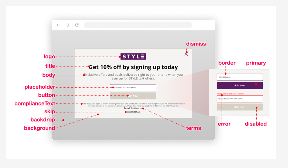
Configurable colors
No background image
With background image (desktop)
With background image (mobile)
| Element | Customizations | Best Practices |
|---|---|---|
font | Use your website’s font family or include a free web font using URL Default font is Verdana | We recommend using a font family already used on your website using the familyName element |
logo | Include a URL with an externally hosted image of your brand logo |
|
title | Add custom text for your pop-up’s title and set the text color, font, and size | |
body | Add custom text for your pop-up’s body and set the text color, font, and size | |
placeholder | Add custom hint text displayed in the form input field and set the text’s color, font, and size | |
button | Add custom button text and set text size, font, and color | |
primary | Primary brand color that displays in the button background color | RGBa value is used by default with alpha value of “1” (displays at 100%), but HEX is supported |
primaryLight | Button background color that displays on hover state | RGBa value is used by default (picked up from 'primary' RGB value) with an alpha value of “0.4” (lightens to 40%) |
disabled | Button background color when the button is in disabled state | |
error | Customize the error text and color, font, and size of inline error text and input box border when the entered input invalid | |
complianceText | Add custom text for the compliance area and set text color, font, and size | |
terms | Add custom text for the terms link and set text color, font, and size. Add custom links if desired. | |
skip | Customize the skip link text and set text color, font, and size | While not recommended due to compliance reasons, you can remove the skip link. Note that users can still opt out by clicking the close “X” icon. |
dismiss | Customize the dismiss “X” icon color | |
backdrop | Customize the layer color of the background behind the pop-up |
|
background | Customize the pop-up modal window’s background color | |
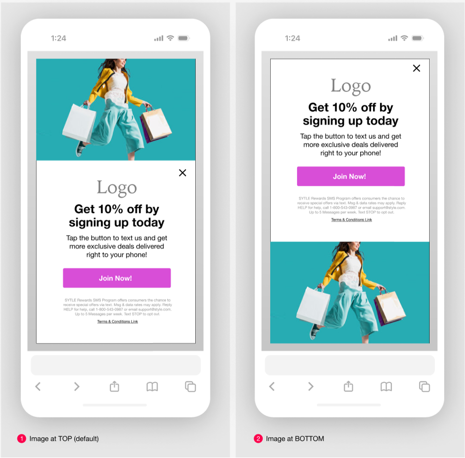
background image | Add an externally hosted URL of an image for your brand, and customize its opacity and placement | Desktop and mobile layouts are available |
border | Border color of the input form field when in normal, non-error state |